Wednesday, January 21, 2009

GIMP: Animated globe

This tutorial takes about 2 minutes to finnish, it's just a basic walk-through that is supposed to help you about the basics with the Spinning Globe script, if course it allows much more advanced end results.
I'm using GIMP 2.6.
Remember, the final image is actually animated!


1. Start GIMP and create a new document, set the canvas to 500x500 pixels.

2. Create a new layer and name it Globe Color, fill it with the color of your choice. Don't get fooled by the name, the fill should cover the whole (rectangular) layer!

3. Select the Text Tool and write anything of your choice. My font settings are as following: Sans, size 59 pixels.
This is how it should look like:


4. Now to the magic, merge the two layers you've made and go Filters->Animation->Spinning Globe.
Set the frame to 13 and check Transparent Background. It's also smart to check the Work on a copy option in case you want to make some minor adjustements or if GIMP crashes during processing.
To test the animation go Filters->Animation->Playback.

5. You're done! This is my result:

And here is another one:

It's a good tip to experiment with the different settings to get the best result.
Read More...

GIMP: Lamp tutorial

This tutorial will create a desk with a lamp on it. To the lamp we'll add some light effects.
Final result:


1. Fire up GIMP and create a new document. Make it 800x600 pixels large.

2. Create a new layer and name it Wall. Do this by pressing the New Layer icon in your layers dialog (A paper with an orange symbol on it).
Make sure the layer Fill Type is set to Transparent.

3. Create another layer and call it Chest Draw, this layer should also be transparent.

4. Grab the Rectangle Selection Tool from your Toolbox and draw a rectangle in the lower right corner. This is going to be the base of the table. A simple cube with a couple of drawers in it. Mine is 110x455 pixels big, you can easily change the size of it by dragging a corner of the selection or tpye numbers in the Rectangle Select dialog in your Toolbox.

5. Fill it with this color: #363432. (First, click on the top color box in your Toolbox and then in the HTML notation text field paste the numbers.

6. In your main menu, go Select->Shrink and shrink your selection with five pixels.
Fill this selection with this color: #727272.

7. Shrink the selection 5 pixels again. Go Edit->Stroke Selection in the main menu and make a 1px stroke with the color #363432.

8. Select the Rectangle Selection tool from your Toolbox, click on your selection to make it active. In the tool's dialog, make the size 88x41 pixels big, repeat the stroke.

9. Move down the selection 40 pixels (making the position 702, 506 if you have followed my directions). Now you have three drawers, but with no knobs. Draw a small rectangle in the upper middle section of one drawer and fill it with: #363432. Do the same to the other two.

10. Now duplicate the layer and place it more to the left, almost in the center of the document. Create a new layer and name it Table Board. Make a thin rectangle that connects the both drawers. Your document should look something like this now:

11. Create a new layer and name it Lamp Base. Again, grab the Rectangle Selection Tool. Create a small rectangle above the left Chest Draw, on top of the Table. I made mine 46x16 pixels big.

12. Duplicate the three Table layers and merge them together. Do this by duplicating them and place them next to each other and mark the top layer, then go Layer->Merge Down a couple of times.

13. Right click the Table Shadow layer and choose Alpha To Selection then click the Delete button on your keyboard. Go Selection->Feather and feather the selection by 8 pixels. Set your foreground color to black and grab your gradient tool. Select Radial as gradient shape and FG to Transparent as gradient Type. Now make a quite big gradient starting from the center of yur selection ednding 50-60 pixels outside of it. Place the Table Shadow layer beneath all other table layers and move the layer a couple of pixels south-east. Now your table should have a drop shadow!

14. Create a new layer and name it Lamp Base. Create a 42x21 pixels large cube on top of your desk. Fill the selection with a wood pattern, I chosed the "Pine?". Select the Ellipe Selection Tool and make a seleciton that covers everything of your lamp base except for the two top corners (my selection is 60x60, a tip is to press and hold down SHIFT while dragging), invert the selection by right-clicking on it and choose Invert. Then press Delete.

15. Create a much thinner but higher rectangle on top of your last one. this one should be 5x57 pixels big.
Fill this with the same pattern. Also make a tiny, tiny one again, this time at the top of the thin one. This is going to be the piece that holds the Lamp in place.

16. Create a new layer and name it Lamp. Create a circle, mine is 63x62 pixels big. Grab the gradient tool and make a FG to Transparent, radial gradient with the color: #403d32. Make it quite big so you'll manage to fill the selection.

17. Copy the Lamp Base layer and name it Lamp Shadow. Do the same as in the Table Shadow steps (13). But this time feather the layer only 5 pixels and use the color #b1a36a in your gradient. Don't forget to put it just above your Table Shadow layer.

18. Select the Wall layer and fill it with the color. #474d41. Then grab the Gradient Tool once again. Set the Foreground color to #f0e4b2 and Background color to #474d41. Then look at the gradient settings. The Mode should be set to Soft Light, gradient type to FG to BG and shape to radial.

19. Create the gradient, starting from the center of the lamp and ending almost in the upper right corner.
Now you are done!

Read More...

Clean Navigation Bar

In this tutorial you'll learn how to create a clean navigation bar.
Result:
  1. Open up a new document 800x150 pixels.
  2. Create a new layer by pressing Shift+Ctrl+N or by going to Layer > New > Layer.
  3. Set your background color to black (#000000) and your foreground color to #424242.
  4. Select the Rounded Rectangle Tool and set the radius to 5 px. Draw a shape like this:
  5. Right-click on the shape and click on Make Selection. Set the feather radius to 0 px and press OK.
  6. Select the Gradient Tool and fill the selection with a gradient from top to bottom. Deselect.
  7. Double-click on the layer to bring up the blending option and use these settings:
  8. You are basically done, now just add some text. I used Verdana 12 pt and the color #c9c9c9. Final result:
Read More...

Sunday, January 18, 2009

OpenOffice Draw: Create a comic strip

How to create a simple comic strip.
I'm using OO Draw 2.4 fo this tutorial.
Final image:


1. Start OpenOffice Draw. Select the Rectangle tool from the toolbox located at the bottom of the window, draw a rectangle. This will be your first comic strip box.

2. Set the Area Style/Filling to Color, and set the color to Blue 8.

3. Now copy that rectangle and make it half as high. Set the color to Green 1.

4. Select the Symbol Shape tool from the toolbox. Select the sun and draw a sun in the top-right corner of the blue rectangle. Set the color to Yellow 1.

5. Now with the same tool, select the smiley face and draw a smiley in the bottom-left corner of the green window.

6. Select the Callouts tool and draw a speech-bubble above the smiley face, drag the tail so it looks better.

7. Select the Text tool and write something in the bubble, I wrote "Hello!".


8. Copy the blue box and drag it to the left, make it smaller so it fits. Do the same with the green box. Also copy the smiley. With the Symbol Tool, create a cloud, choose the color White 1. Create another speech bubble and write something, I wrote "What a beautiful day!".

9. This is basicly it, play around with the different shapes and experiment.

10. Here's what my final comiclooks like:

Read More...

Inkscape: Create an analog alarm clock

For this tutorial I'm using Inkscape 0.46
This tutorial describes how to create an analog alarm clock in Inkscape.
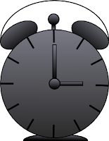
This is the final result:


1. Select the circle tool from the left panel, hereby called the toolbox.

2. Draw a perfect circle somewhere in the middle of your document, by holding down CTRL.

3.Right-click your new circle and choose Fill and Stroke, or press CTRL+SHIFT+F.

4. In the Fill and Stroke dialog, click on the Fill tab. Make the fill a white flat colored one by clicking on the little blue box at the top of the dialog. The RGBA value should be ffffffff.

5. Now click on the Stroke paint tab. Do the same here, make the stroke a solid black flat colored one (RGBA value: 000000ff).

6. Now you should have a white circle with a black border in your document.
Let's create an ellipse, this is going to be one of the two bells, so it shoud be significant smaller then the first circle you made.

7. If your not happy with the size of it, drag the appropriate arrows surrounding it. Then click on it, the arrows around will change. Now when you use an arrow it will rotate the bell, rotate it about 45 degrees and place it on your big circle. In the main menu, go Object->Lower (or press PgDown on your keyboard) until your bell is behind the big circle.
It should look something like this:
8. Copy your bell and paste it. Select the left bell, in the top of the main window copy the Y-coordinate (the verical coordinate). The click on the second bell and paste the Y-coordinate. In the main menu click on Object->Flip Horizontal.

9. Select both the left bell and the big circle, by holding shift down and select first the bell, then the big circle. Then go Object->Align and Distribute, or press CTRL+SHIFT+A. Make sure the Realtive to drop-down option is set to Selection, then press the Align to left sides icon. It's located in the upper-left part of the Align box.

10. Repeat step 11, but this time with the right bell selected. Align the right sides this time.

11. Now grab the text tool and click somewhere in your document. Draw 12 I's with 4 spaces between them (press I, then tap space bar 4 times, then write an I again etc). My font preferences are Bitstream Vera Sans, size 40.

12. Select the big circle, then go Path->Object to Path. Select the Edit Path tool in your toolbox and select the top node of the big circle. Then click on Break path selected nodes from the Edit path toolbar. Then click Path->Reverse.
Select the text and the circle, go Text->Put on Path.

13. Now select the big circle and the two bells. In the top of the window, besides the object coordinate you can change the width and/or height of the selection. Click on the lock to make sure that you'll maitain the ratio between width and height. My height was originally 329.812, I changed this to 263.812. This is to make the text numbers look better inside the clock. After that, you may want to rotate the numbers a bit to make them look more straight.

14. Now create a rectangle, it should be rather thin and the length should cover from the bottom of the number 12 in the clock, down to the middle of the circle. Copy that and make it half as long, then rotate it a bit.

15. Create a circle in the middle of the big circle, just to cover up the clock's hands. Copy the big clock hand and the little circle, move the new little circle on top of the new hand and put them in the middle of the bells. Click Object->Lower to hide unnessecery parts.

16. Create a new ellipse, this is going to be a handle bar. In the circle toolbar, set 180 in the Change Start field.

17. Create a new ellipse, at the bottom of the clock. It should be a half-circle as of what you did in the last step, that's perfect, exactly what we want.

18. Time to do some coloring! But before we start, does your clock look something like this?


19. Great, let's move on! Right click the left bell and choose Fill and Stroke. In the Fill tab choose Linear gradient and then click the edit button.
Select the stop first in the list and set the RGBA value to: 000000ff.
Then select the second stop and set its RGBA value to: 7a7a86ff.
Now the gradient is applied, but it's not looking that good. Choose the Edit Path tool in the toolbox and drag the gradient lines u
ntil you are happy. It should look something like this:

20. Now select the right bell and do the same, repeat this until almost every part of your clock is colored.
You can change the gradient tone if you want to. For example, for the big circle I chosed a dark grey color instead of plain black. Of course you may play around with real colors as well.

21. Now you are done!
This is my final result:

Read More...

Photoshop: Blue Navigation Bar

In this tutorial you'll learn how to create a simple blue navigation bar.
This is the result:
  1. Open a new document 700x150 pixels and fill the background with #1a1a1a.
  2. Create a new layer and select the Rectangular Marquee Tool and use these settings:
  3. Make a selection like this:
  4. Select #2575c4 as your foreground color and #1f5f9f as your background color, then grab the Gradient Tool. Fill the selection with a gradient from top to bottom.
  5. Create a new layer and then select the Rectangular Marquee Tool. Use the same settings as before but change the height to 25px. Now make a selection of the top half of the navigation bar.
  6. Fill the selection with white and then change the opacity of the layer to 5%.
  7. Create a new layer and select the Pencil Tool with a diameter of 1 px. Select #133c64 as your foreground color and then draw a line like the image show:
  8. Now draw a line next to it with the color #2d8be8.
  9. Duplicate and move the layer several times so you get this:
  10. Now you are almost done. Just add some text to the buttons, I used the font Verdana. Result:
Read More...

Thursday, January 15, 2009

Photoshop: Selective Color

In this tutorial you will learn how to keep certain objects colored while turning the rest of the image black and white.
Final result:

  1. Open the image. I used this image:
  2. Go to Layer > New Adjustment Layer > Black & White.
    Press OK twice.
  3. Now you have to select the parts of the image that you want to keep colored. I wanted to keep the color of the butterfly and I used the pen tool to select it, but you can use any method.
  4. Fill the selection with black.
  5. If there are any mistakes where the color has gotten outside of the object or if the object has been turned black and white you can correct that. Grab the brush tool and paint the areas that you want to colorize with black. Paint the areas that you want to turn black and white with white.
You're done! Final result:
Read More...

Tuesday, January 13, 2009

Photoshop: A4 Paper

This is the result of this tutorial:


I'm using Photoshop CS3
  1. Open up a new document 600x600 pixels.
  2. Create a new layer and fill it with white.
  3. Go to Layer > Layer Style > Blending Options (or double-click the layer). Use these settings:
  4. Create a new layer. Select the Rectangular Marquee Tool and use these settings:(This is the ratio of an a4 paper, if you'd like to create a different shape use style: normal)
  5. Make a selection like this:
  6. Fill the selection with #f8f8f8
  7. Now we're going to add some texture to the paper. Go to Filter > Noise > Add Noise and use the following settings:
  8. Layer > Layer Style > Blending Options:
  9. Change the opacity of the layer to 90-95%. You're done!
This is my final image (I just duplicated and rotated the layer):

Read More...

Sunday, January 11, 2009

GIMP: Custom Brush

This tutorial will show you how to create and add a custom brush into your GIMP program.
This tutorial takes under 5 minutes if you already have made or found an image you want to use as a brush. I'm using GIMP 2.6.


1. Create a new document or open up a picture you'd like to save as a brush.
I started out on a 200x200 pixels big canvas. I did this, and then I cropped it.
2. Make the "Background Layer" invisible by clickin on the eye next to it in the "Layers Dialog" Window" (This is to make the brush transparent, I don't want the background when I use my brush).
Go "File"->"Save as", and save it as a GIMP Brush (.gbr).

In Linux (Ubuntu 8.10) save it in your "/home/USERNAME/gimp-2.6/brushes/" folder.

In Windows XP save it in your "C:\Document and Settings\USERNAME\.gimp-2.6\brushes\
"
4. Select the "Brush Tool" and then click the select brush button, then open the "Brush Selection Dialog" by clicking the brush icon down in the right corner of the popup window.

5. In the "Brush Selection Dialog" click the small, grey arrow in the upper left corner, then "Brush Menu"->"Refresh Brushes".
6. Now you are done, create a new document and test your brush.
This is my result:


Read More...